CSS3 Tutorial – Positioning & Inline
 You can do quite a bit with positioning. And until you understand positioning, you will just be hacking at your code.
I learned a lot from Learn CSS Positioning in Ten Steps. I owe him at least a beer. Check out his example that I have wholesale adopted.
There are three positioning schemes:
- Normal flow. In CSS 2.1, normal flow includes block formatting of block-level boxes, inline formatting of inline-level boxes, and relative positioning of block-level and inline-level boxes.
- Floats. In the float model, which is how we did the aside, a box is first laid out according to the normal flow, then taken out of the flow and shifted to the left or right as far as possible. Content may flow along the side of a float.
- Absolute positioning. In the absolute positioning model, a box is removed from the normal flow entirely (it has no impact on later siblings) and assigned a position with respect to a containing block.
Let’s see how they work.
Starting Point
Let’s begin with some stylized HTML.
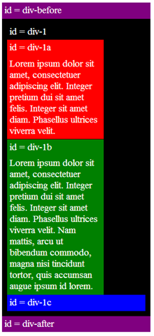
With no positioning, that code produces this:
Positioning Example
position:static
The default positioning for all elements is position:static, which means the element is not positioned and occurs where it normally would in the document.
Normally you wouldn’t specify this unless you needed to override a positioning that had been previously set.
(Same picture as in the preceding section, so I will not repeat it)
position:relative
If you specify position:relative, then you can use top or bottom, and left or right to move the element relative to where it would normally occur in the document.
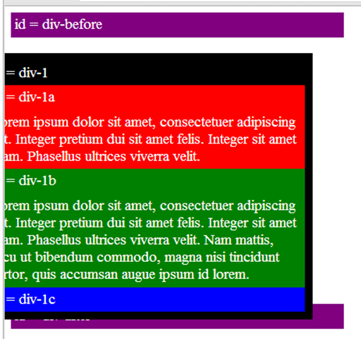
The style moves the image off to the left of the screen. And you can see the space between div-before and div1. That is because div-1 still occupies the space even though its image has been shifted.
position:absolute
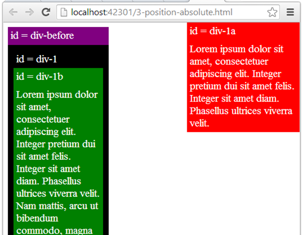
When you specify position:absolute, the element is removed from the document and is shifted to exactly where you tell it.
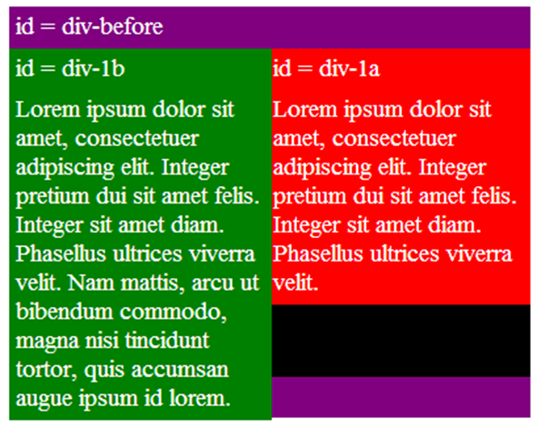
In this case. the red section is at the top right of the page.
The rest of the div is squished to the left because it occupies 35% of the width. The div-1b element is directly below the black because div-1a was removed.
position:relative + position:absolute
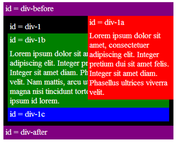
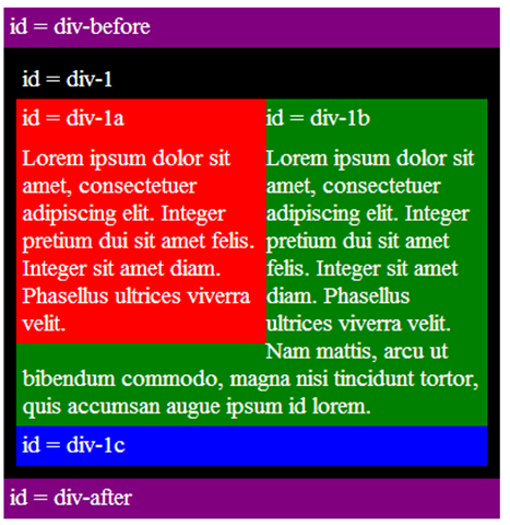
If we set relative positioning on div-1, any elements within div-1 will be positioned relative to div-1. Then if we set absolute positioning on div-1a, we can move it to the top right of div-1.
two column absolute
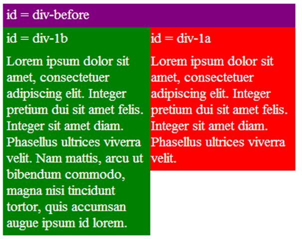
Now you know enough to make a two column that uses both relative and absolute positions.
This is not to be confused with the two-column that wraps that is part of CSS.
two column absolute height
One solution is to set a fixed height on the elements.
But that is not a viable solution for most designs, because we usually do not know how much text will be in the elements, or the exact font sizes that will be used. And with responsive design, the text length changes based on the display’s width.
So this still does not look right.
float
For variable height columns, absolute positioning does not work, so let’s come up with another solution.
We can “float” an element to push it as far as possible to the right or to the left, and allow text to wrap around it. This is typically used for images, but we will use it for more complex layout tasks (because it’s the only tool we have).
float columns
If we float one column to the left, then also float the second column to the left, they will push up against each other.
float columns with clear
Then after the floating elements we can “clear” the floats to push down the rest of the content.
This is good.
and if there is not enough room, then the columns wrap, as you would expect.
Inline vs Inline-Block vs Block vs Float
As you have seen when you have float in your CSS code, you need to be careful about elements surrounding the floated elements. You must also avoid following elements in the code to sneak up next to it. In addition, if you have a floated list that will take up several rows (visually speaking) and the content is of varying height, the code may now work as you expect.
Enter inline, block, inline-block.
Inline elements:
- Respect left & right margins and padding, but not top & bottom.
- Cannot have a width and height set.
- Allow other elements to sit to their left and right.
- In other words, it tolerates HTML elements next to it.
Block elements:
- Respect left & right margins and padding, but not top & bottom.
- Force a line break after the block element.
- In other words, it has some whitespace above and below it and does not tolerate any HTML elements next to it.
Inline-block elements:
- Allow other elements to sit to their left and right
- Respect top & bottom margins and padding.
- Respect height and width.
- Is placed as an inline element (on the same line as adjacent content), but it behaves as a block element.
inline-block
Using inline-block for the display property makes your elements inline, but preserving their block capabilities such as setting width and height, top and bottom margins and paddings.
So this works as we want.
But what happens when there are more items, such as in item two? The code includes a fix for inline in IE7.
However, you may have already noticed a giant drawback, that might or might not apply to your use case. Because elements become rendered inline, white-space in your HTML code will affect the rendering. That means, if we want perfect size and alignment, yet we have space between the li elements in our code example, it will render a 4 pixel margin to the right of each element.
Here is the fix:
References
Learn CSS Positioning in Ten Steps
CSS display: inline-block: why it rocks, and why it sucks
Sample Code
Sample code is available in the DevDays GitHub repository. See https://github.com/devdays/html5-tutorials






One comment